In Renaissance polychrome sculptures, blue was ‘the noblest, most beautiful, and perfect of all colours.’
Cennino Cennini proclaimed this in his treatise, The Craftsman’s Handbook (ca. 1400 CE), when describing ultramarine blue, the most valued pigment of the Renaissance. Ultramarine was made from lapis lazuli, a rare semi-precious stone imported from the Middle East. The pigment was extremely difficult to produce and required grinding the stone into a fine powder, mixing it into a poultice, and extracting the most vibrant shades. The purest yields sold for as much as, if not more than the price of gold, which was thousands of times more expensive than cheaper pigments such as lead white.
Less expensive blues such as azurite and indigo could be mixed with or used to imitate ultramarine to help save costs on materials. Azurite, also known as German blue, was made from a stone with a similar chemical composition as the green pigment malachite, which explains why it discolours to green when it is exposed to moisture. Indigo, made from plant extracts imported from Baghdad, was by far was the cheapest blue available. It was the least favoured by painters because of its dark tone and tendency to fade. In comparison to azurite and indigo, ultramarine had good colour permanence, which is another reason why it was so valued and so costly.

Photo credit Una D’Elia.
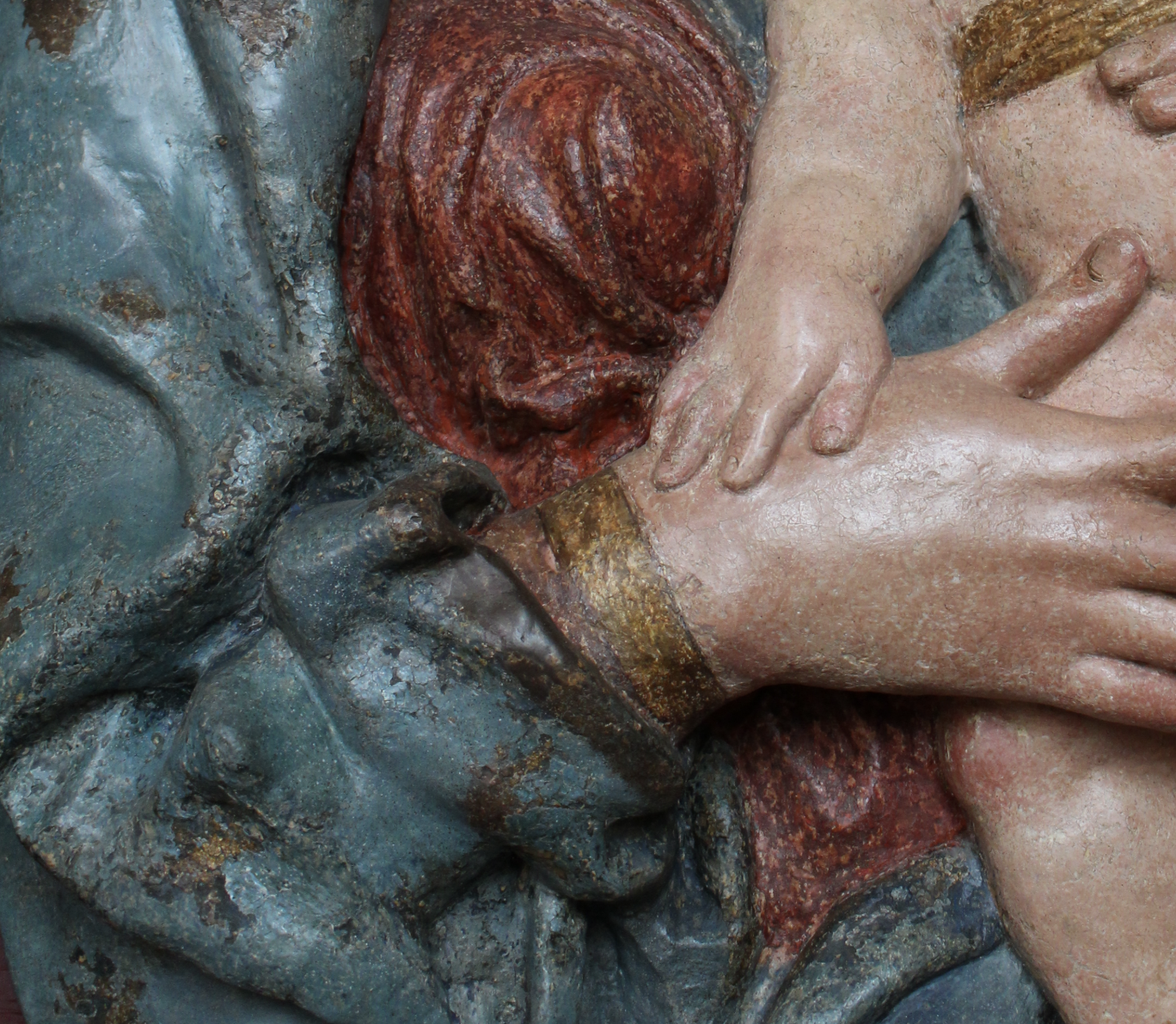
Although it is hard for us to know what is being depicted in this fragmentary painted sculpture above, we know from the blue mantle the figure is the Virgin Mary. In this sculpture, Mary sharply leans back suggesting that she played a role in a larger narrative scene, perhaps one where she reacts to a visit from the angel Gabriel, or one where she gasps from the pain caused by watching her son’s death. The painter who coloured Mary decorated her expensive red underdress, a common colour pairing to her blue mantle, with jewel-toned blue swirls and ornamental motifs. These precious blue and red pigments heighten her status as a figure worthy of veneration.
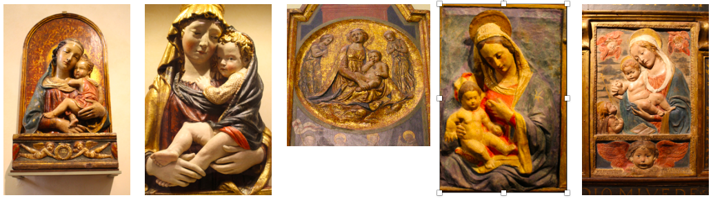

Photo: Una D’Elia.
Reproducible Madonna and Child reliefs, including the ones featured above, were an affordable type of sculpture made for middle-class patrons in the fifteenth century. Each replica could be customized with different colours according to a buyer’s wishes and their price range. In the Madonna and Child to the left, the painter transformed the cheap stucco sculpture into a lavish display of blue. Jesus intimately leans towards his mother, resting on her soft, fluid, blue drapery heightened with gold. Gold was also used in the waves of Mary’s hair and the cloth that envelops the young baby boy. Surely reliefs such as this one were valued for their artistic worth and materials as much as their devotional function.

Benedetto da Maiano, Crucifix, painted wood, ca. 1490-5, Museo di San Marco, Florence.
Photo: Una D’Elia.
Second to the Virgin’s robe, blue often appears on Jesus’ loincloth in scenes of the Crucifixion. This painted wooden sculpture above likely belonged to the Dominican friar Fra Girolamo Savonarola, who called for the destruction of profane or luxurious works of art. Ironically, Savonarola used religious art, including this small crucifix, in his devotional practices. In this sculpture, Jesus’ loincloth was painted with the most opulent blue, ultramarine, mixed with azurite, red lake, and lead white to create a soft royal purple. Savonarola’s public teachings and conflicting personal practices point to the increasing tension between the representation of luxury and humility in fifteenth-century Christian art.
The Della Robbia workshop found another use for blue in their pioneering technique of glazed terracotta. As this Madonna and Child relief below demonstrates, they almost always moved blue from Mary’s mantle to the back of the relief, replacing her drapery and the entire figure with white. Here, the blue ground evokes notions of an open, heavenly sky. At the same time, the blue’s pairing with white relief figures also alludes to expensive ancient cameos carved from precious gems, which were avidly collected by fifteenth-century artists and merchants.
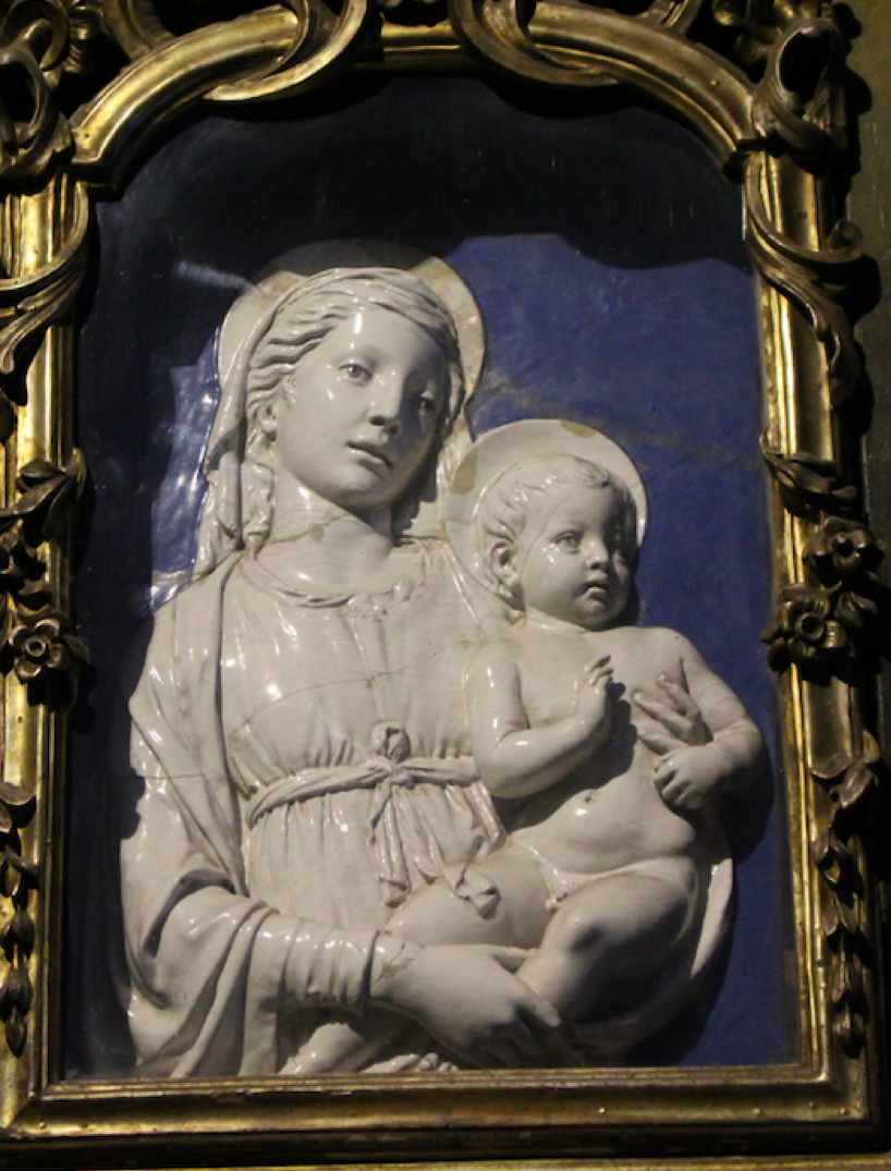
Photo credit: Una D’Elia.
Although the Della Robbia sculptures were seen a new invention in the fifteenth century, today it is well known they adapted the materials and techniques of ceramists. Like ceramists, their blues were made from cobalt, an inexpensive pigment imported from Germany. Cobalt is a potent colourant, as can be seen on the maiolica ceramic tiles in Pisano’s Madonna and Child marble relief below. Unlike ceramists, however, the Della Robbia’s added high proportions of tin-oxide, a whiting agent, to cobalt to make their blues more opaque than the blues used for maiolica pottery.

Andrea Pisano, Virgin and Child, marble and glazed terracotta, ca. 1337-1343.
Florence, Museo dell’Opera del Duomo. Photo credit: Una D’Elia.
The Della Robbia’s also used blue naturalistically, as can be seen in the the Madonna and Child below. The Mother and Child have flesh tones and Mary is presented in her traditional blue mantle, making this scene appear like a three-dimensional, life-like painting. However, unlike painters who enhanced the highlights and shadows of Mary’s drapery with white and black, the Della Robbia’s relied on the reflective properties of their glazes to model their colours with light. Looking at Mary’s blue mantle, we can see the highlights shimmer brightly on the highest portions of the relief while shadows are cast in the deepest recesses of its folds. The photographs suggest just how animate Mary appears in person, as the blue glaze’s shine produces continually shifting, almost dancing light effects across its surface.

Luca, the founder of the Della Robbia workshop, also used blue to colour the eyes of holy figures. In the scene of the Visitation below, the young Virgin Mary, pregnant with Christ meets with her elderly cousin, Saint Elizabeth, who kneels below and is also miraculously pregnant. These two figures are coloured almost completely in white; just their eyes are enlivened with blue and further enhanced with near black manganese-purple outlines. This small glimpse of life-like colouring focusses the viewer on the emotional bond between these two women.
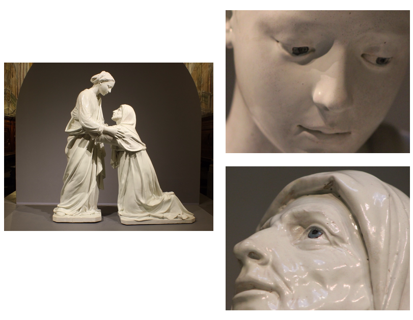
Photo: Rachel Boyd.
In polychrome sculpture, blue was the colour of opulent drapery, luminous skies, and tender, emotive eyes. And no matter its source, as either an expensive pigment or a much more affordable but luminous glaze, blue could both enliven and embellish bare sculptural materials made of cheap stucco, terracotta, and wood. Indeed, it was the material splendour and natural beauty of blue that made the colour so versatile in the Renaissance.
Please note that all images are available, with further information, on the Renaissance Polychrome Sculpture in Tuscany website (qspace.library.queensu.ca/handle/1974/14832).
Bronwyn Bond, Queen’s University
Bibliography
Cambareri, Marietta, Abigail Hykin, and Courtney Leigh Harris, eds. Della Robbia: Sculpting with Color in Renaissance Florence. Exhibition catalogue. Boston: MFA Publications, Museum of Fine Arts Boston, 2016.
Cennini, Cennino. The Craftsman’s Handbook. Trans. Daniel V. Thompson, Jr. New York: Dover, 1960.
Dunlop, Anne. “Materials, Origins, and the Nature of Early Italian Painting.” In CrossingCultures: Conflict, Migration and Convergence, ed. Anderson, Jaynie, 472-6. Carleton, Vic.: Miegunyah Press, 2009.
Gage, John. Color and Culture: Practice and Meaning from Antiquity to Abstraction. Boston: Little, Brown and Company, 1993.
Jolly, Anna. Madonnas by Donatello and His Circle. New York; Frankfurt: Peter Lang, 1998.
Kubersky-Piredada, Susanne. “The Market for Painters’ Materials in Renaissance Florence.” In Trade in Artists’ Materials. Markets and Commerce in Europe to 1700, ed. Jo Kirby, Susie Nash and Joanna Cannon, 223-43. London: Archetype Publications, 2010.
Kirby, Jo. “The price of quality: factors influencing the cost of pigments during the Renaissance.” In Revaluing Renaissance Art, ed. Gabriele Neher and Rupert Shepherd, 19-42. Aldershot: Ashgate, 2000.
Pope-Hennessy, John W. Luca Della Robbia. Ithaca, N.Y: Cornell University Press, 1980.
Pastoureau, Michel. Blue: The History of a Color. Princeton and Oxford: Princeton University Press, 2001.
